AHKI
IDENTITY DESIGN
THEIR IDENTITY
AHKI is a Native American and Black owned cannabis company based in Michigan. The company is built on educating their consumers, diversity and inclusivity, and operating with integrity. The owners of AHKI wanted to take inspiration from the Ojibwe tribe and their symbolism and then tie that into their brand. Brotherhood was an important concept to their brand as well. They work to create a company and community that has a brotherly culture.
The word, AHKI, itself means earth, land, or soil. The use of earthy tones for the brand’s color scheme is used to connect that meaning to their identity. To portray the idea of brotherhood, the “H” with the dots above it is inspired by the Ojibwe’s symbol for brothers.
PATTERNS
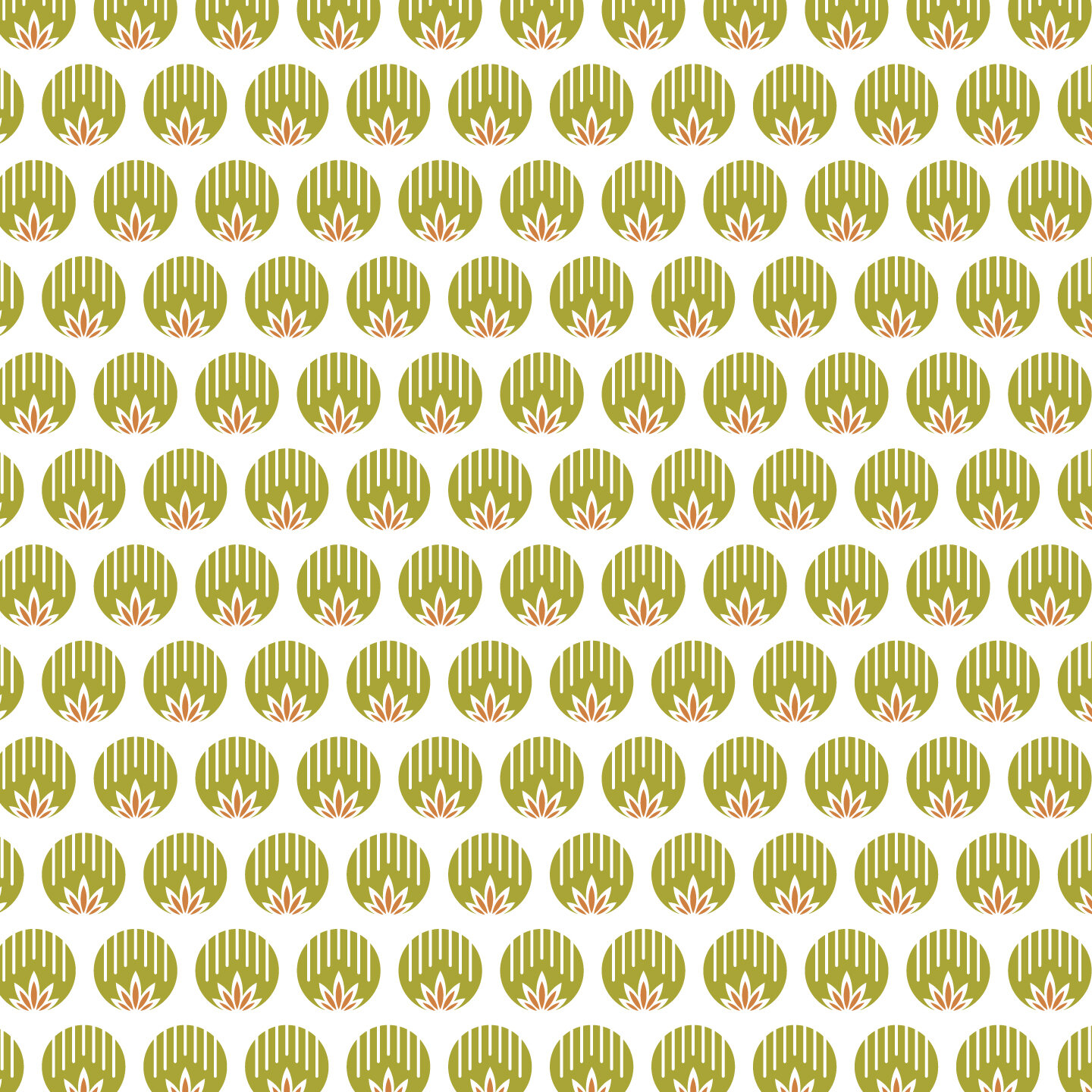
This pattern is to help augment the brand by continuing to draw inspiration from the Ojibwe tribe. A combination of their symbol for rain, which represents renewal, change, and plentiful crops, and a marijuana leaf. This union of symbols highlights the company’s dedication to cultivating high quality cannabis products and their efforts to advance the industry to one that is based on integrity.


