University of Michigan Health Plan
REBRAND | PRINT & DIGITAL DESIGN
REBRAND LAUNCH PIECE
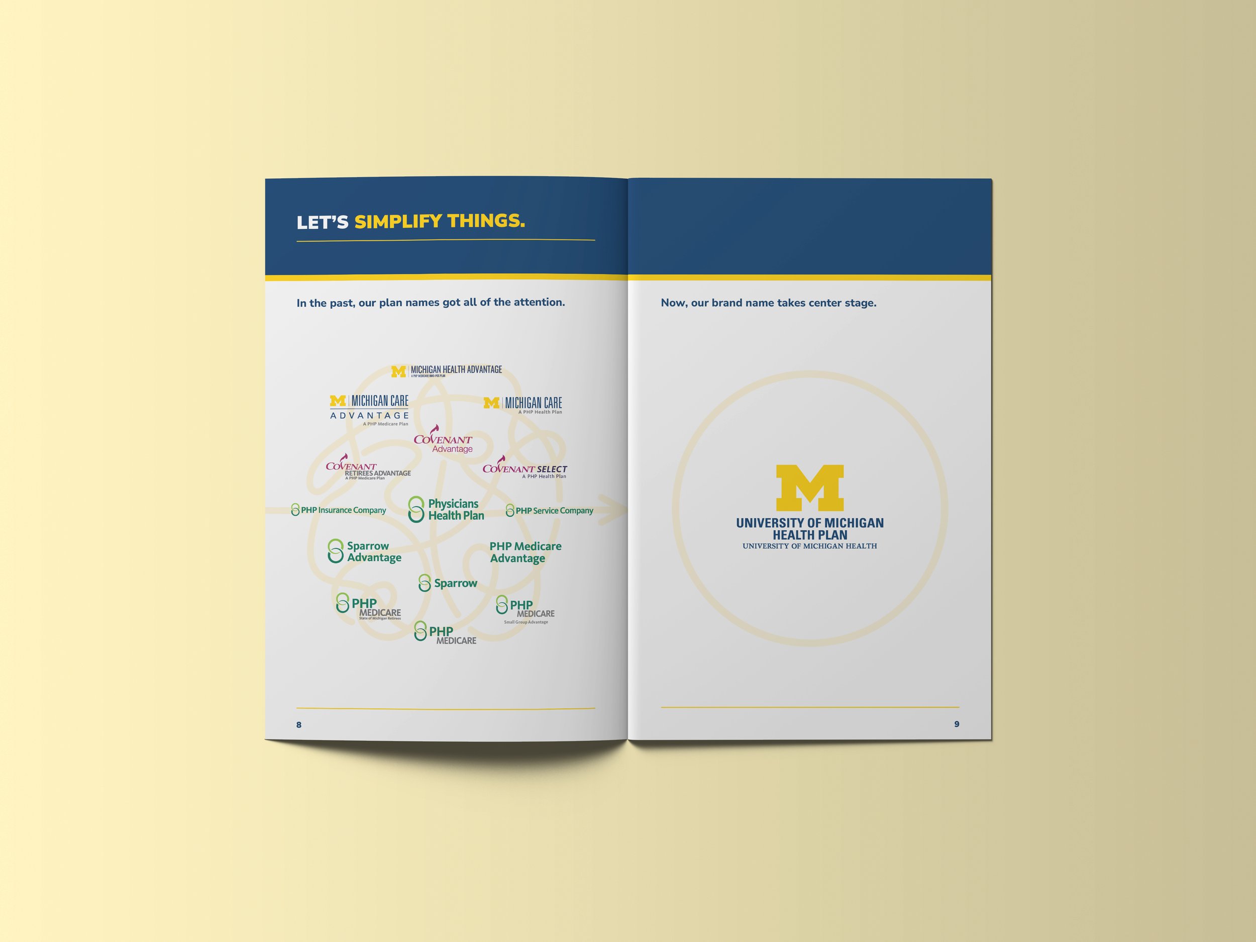
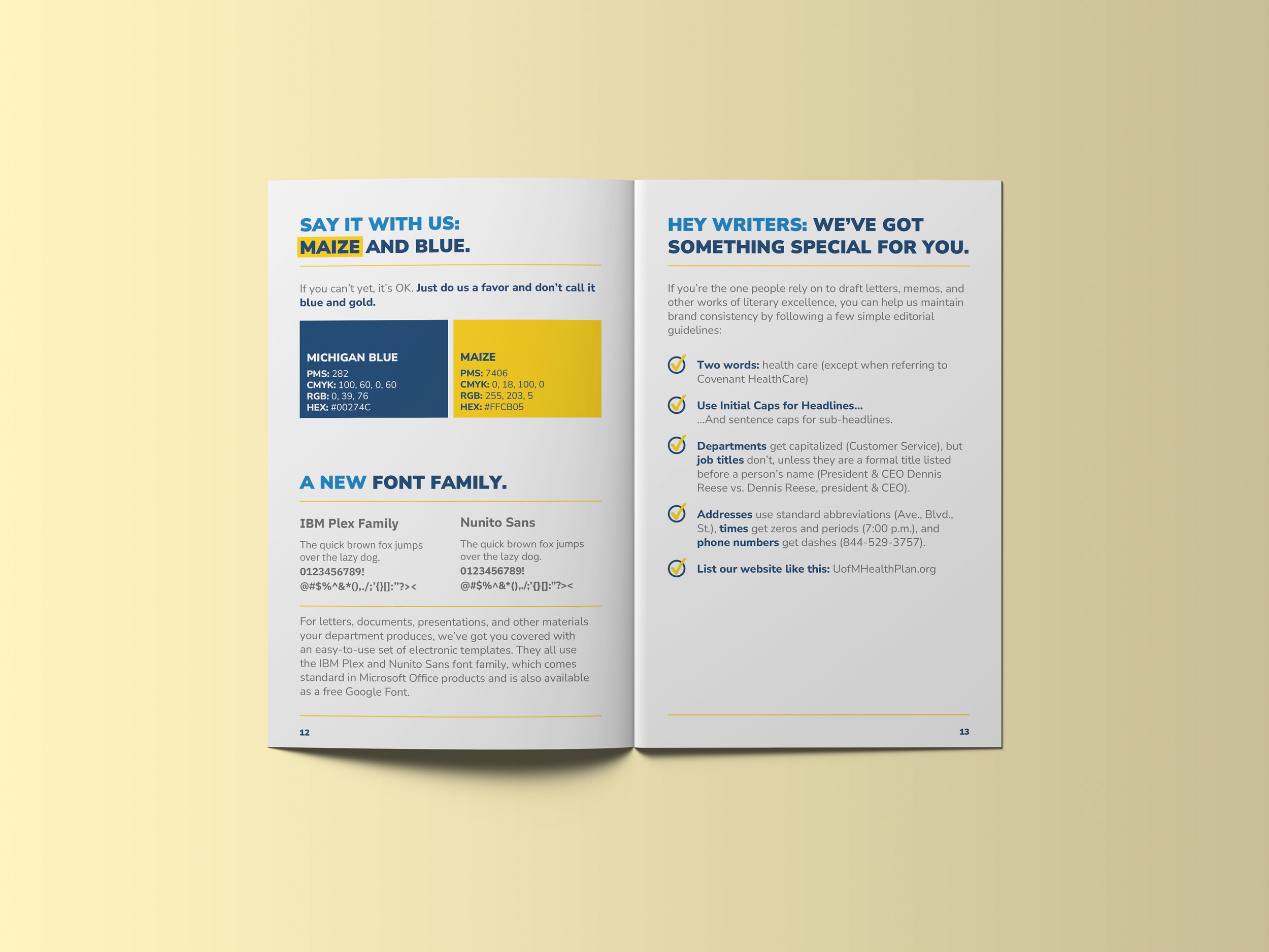
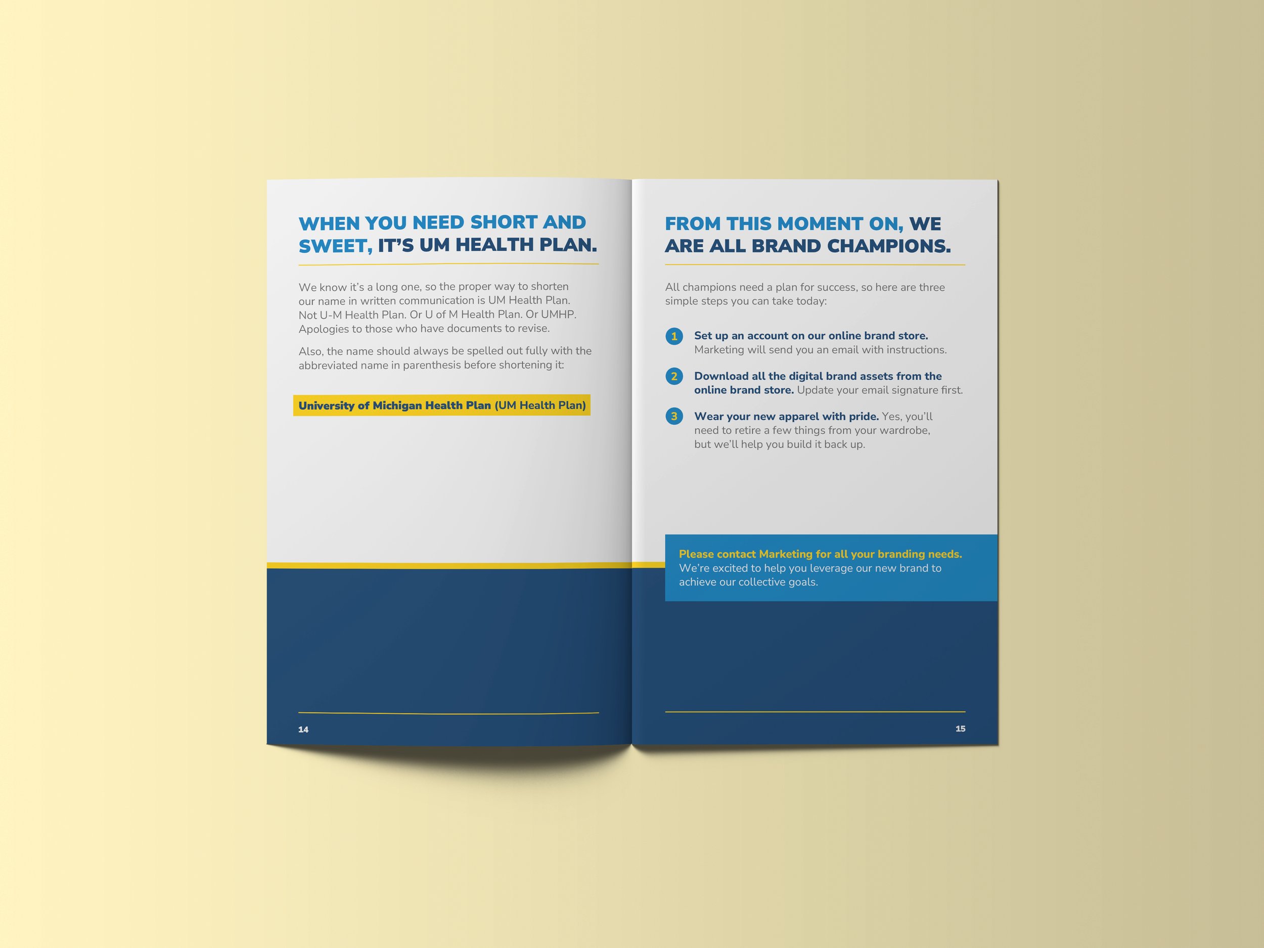
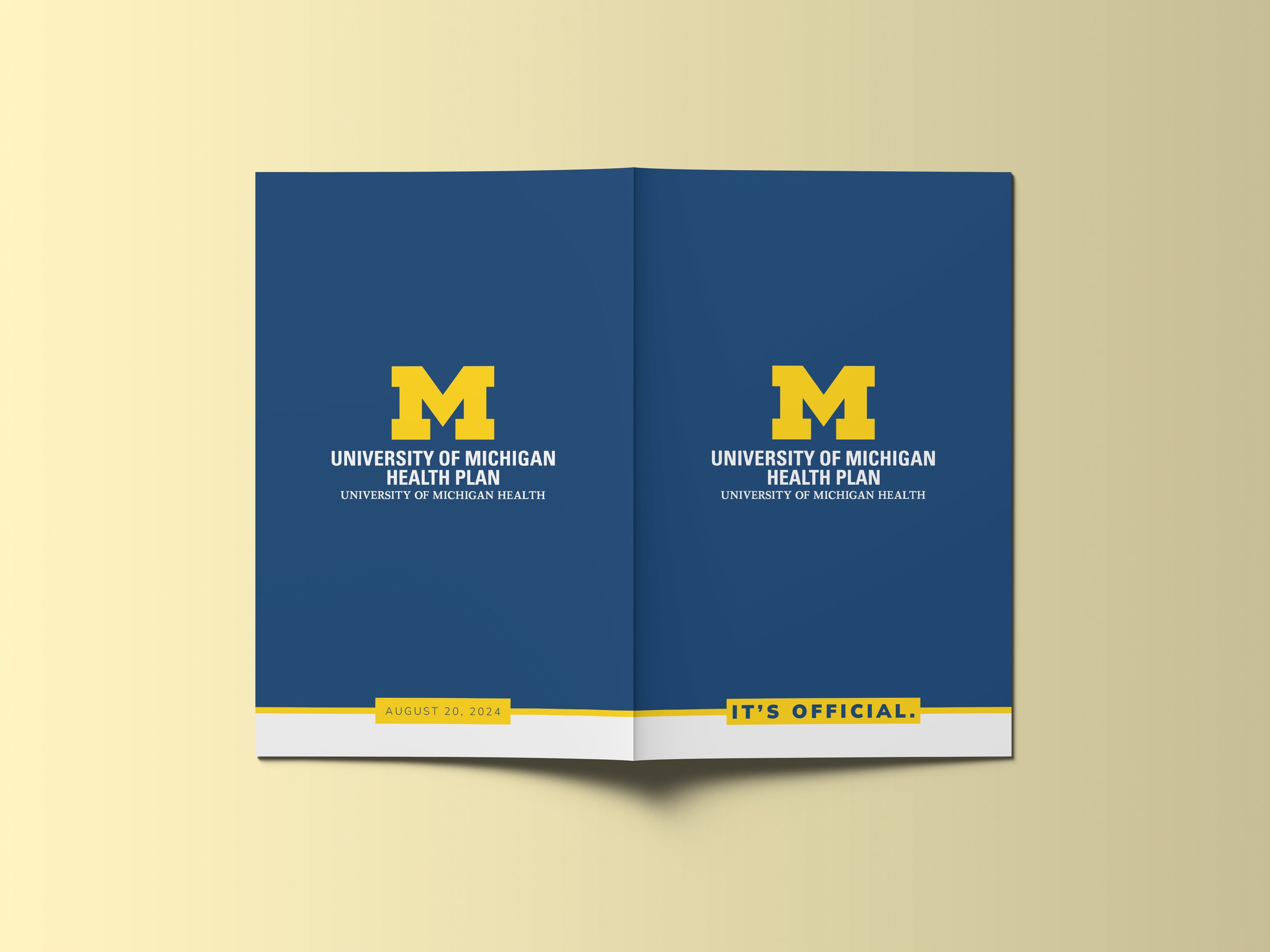
In order to get employees excited and bring awareness and understanding to our new brand standards, this “Hype” Piece was created. Filled with information essential to our new brand and bold design to catch the eye of viewers, this piece served as a tangible item that could be handed out to employees at the rebrand event and get them excited, or hyped up, for what’s to come. This was a chance to also launch the design path of the new brand and to influence future work and exist as a reference point for both design and our new guidelines. The distinguished, respected “M” that strongly represents the University of Michigan guided design and the decision to play off of the boldness and blocked color element of it.



OVERVIEW BROCHURE
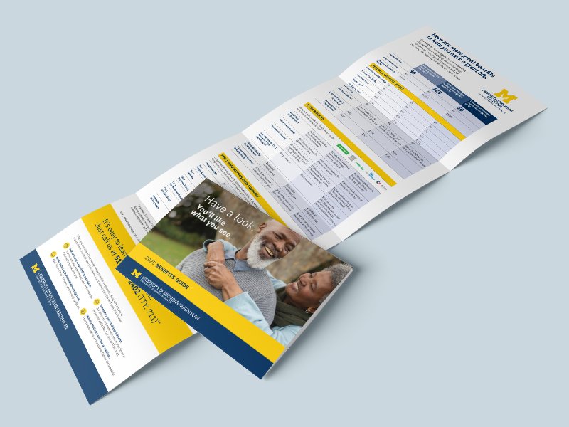
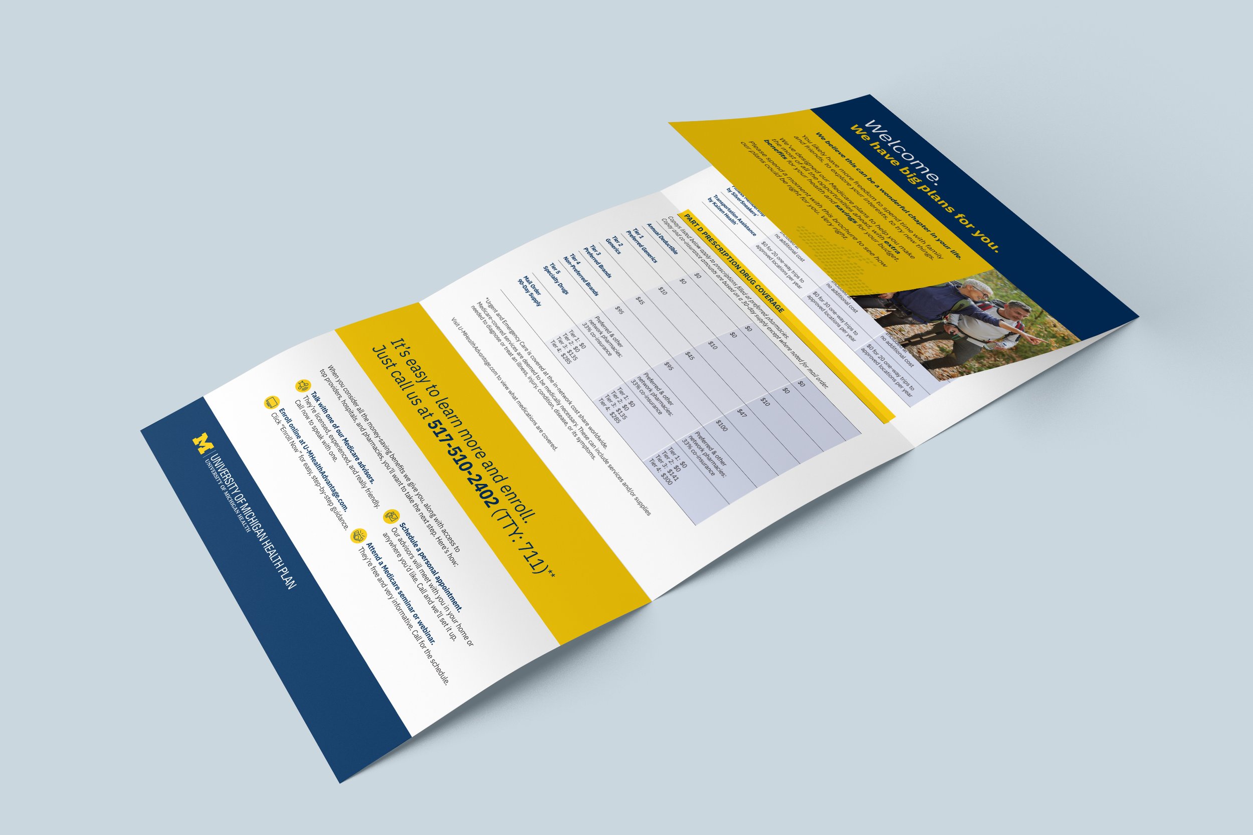
This overview brochure was a printed piece designed to be handed out at events or to prospects interested in our insurance and delivers key information that would encourage and entice them to learn more.
Photography was chosen to be representable of and relatable to possible costumers, and the overall design utilizes call-outs and iconography to quickly grab attention.
PRINT MATERIALS
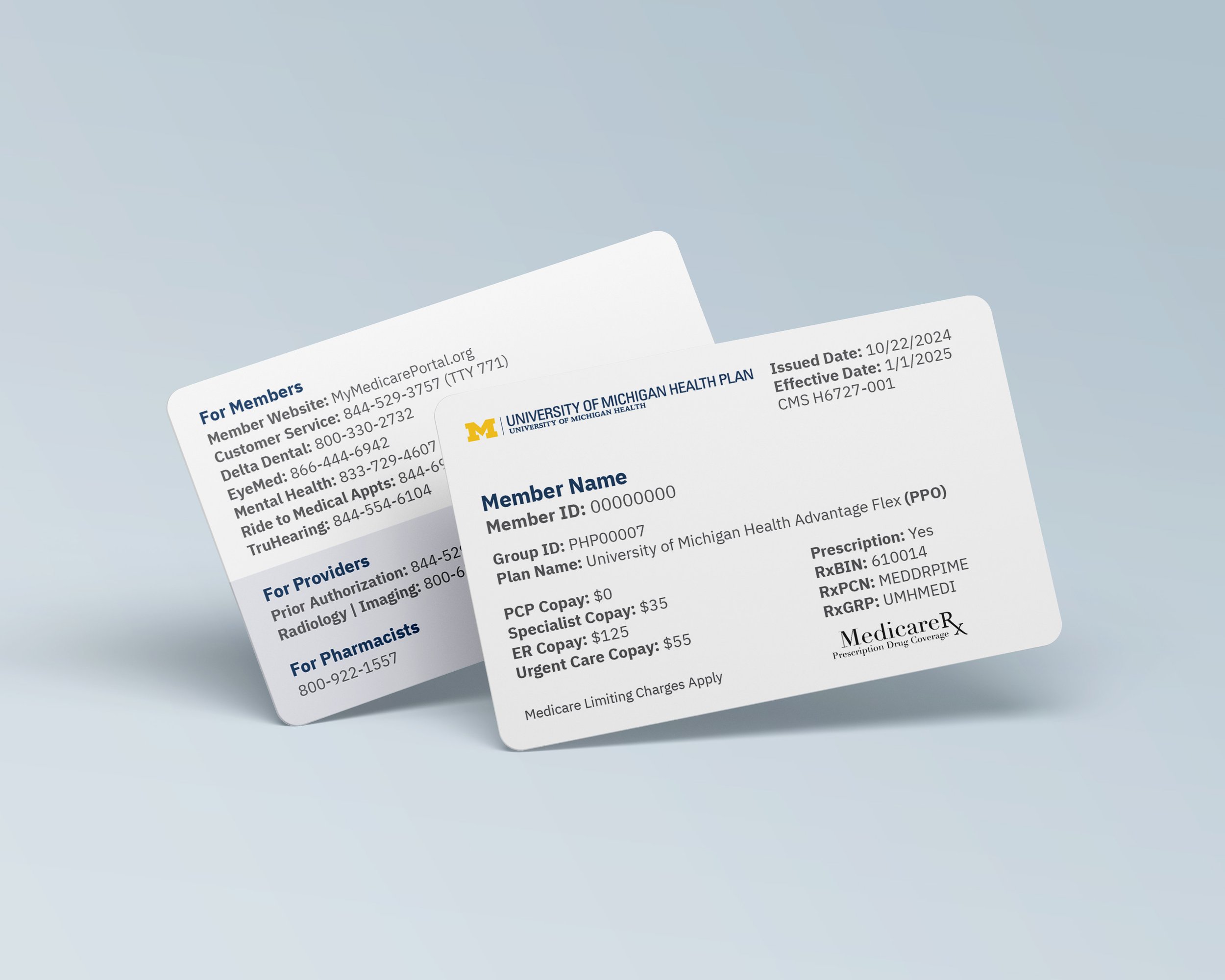
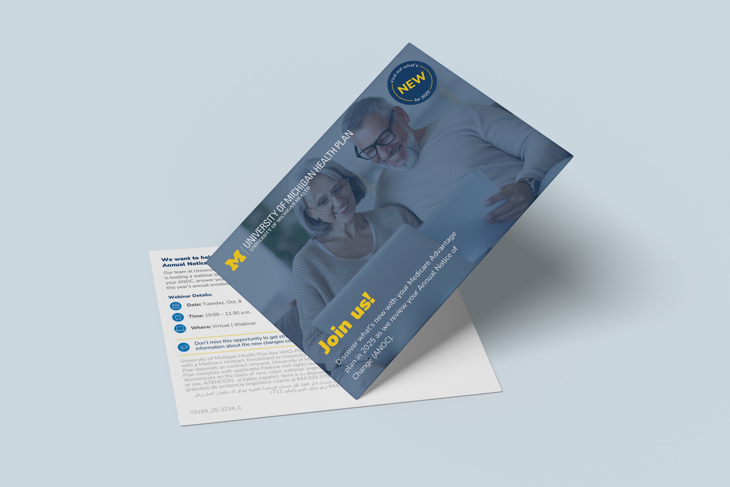
At University of Michigan Health Plan, I created a variety of print materials, including brochures, flyers, newsletters, direct mail, social media assets, infographics, and more. These materials supported both the Commercial and Medicare lines of business and were done alongside Compliance to ensure regulatory requirements were met and with our print vendor to guarantee any printed pieces were done properly. To see a recent example of a newsletter, where an extensive amount of information needed to be organized and presented, please click here.
