Frondescence
IDENTITY DESIGN
EXPERIENCE NATURAL MAGIC
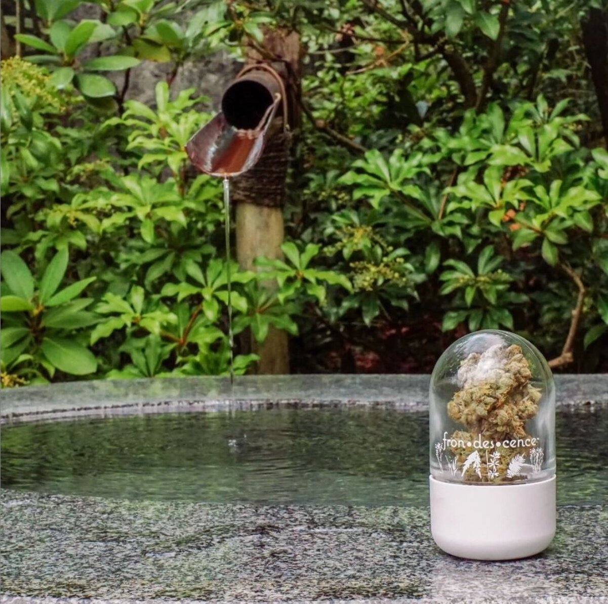
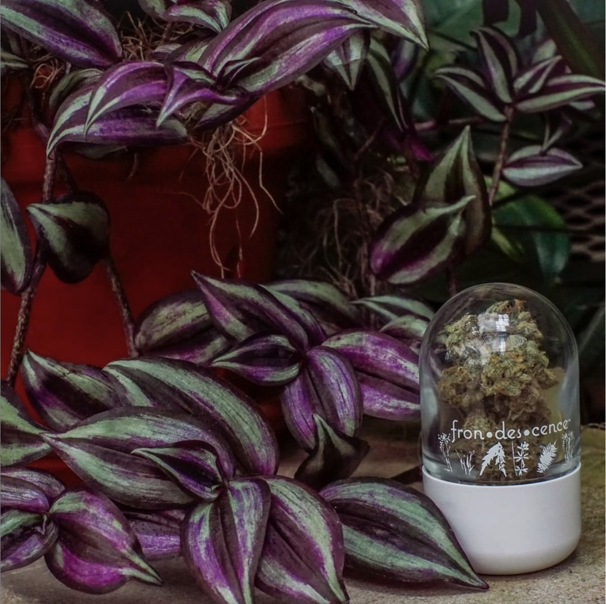
Frondescence is a brand created for women that is built on soulfulness, self care, and high-quality cannabis. This luxurious cannabis flower is pre-packaged and provides an escape from life’s everyday stress giving you the opportunity to unwind and relax. With Frondescence, you are given the chance to reconnect and take care of your mind, body, and soul through a botanical natural remedy and with nothing but the best cannabis. This brand is spiritual, feminine, and natural in its essence.


PACKAGING & BRANDING
The combination of earthy and jewel tones with floral design elements reflects Frondescence’s roots in cultivating a luxurious, botanical natural remedy that allows women to calm their mind, body, and soul.
Frondescence means “the time at which a plant unfolds its leaves,” so it was important to capture the natural meaning behind this brand. By involving the botanical graphics in rich emeralds, golds, reds, and pinks within the brand’s identity, its image immediately appeals to clients looking for a high-quality product and highlights the notion of “natural magic” as advertised in the tagline.
WEB DESIGN
Along with creating the brand identity, Frondescence needed a website that highlighted their values and captured the spirit of their product. Frondescence is a brand that celebrates women and giving back to the community, so it was important to incorporate those elements into their website and to show viewers how this product can fit into their life.


